Franchising, retail, business

23/06/2015
Good news for cyclists who couldn’t quite figure out how to stuff their happy meals into their messenger bags: McDonald’s has you covered. Sort of.
For its newest ad campaign, the burger-slinging chain partnered with global ad agency Tribal to design a new form of packaging made specifically for people on two wheels.
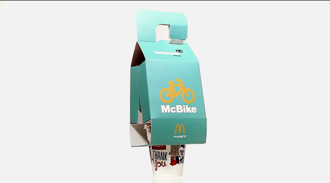
Called the McBike, the packaging is designed to carry a burger, fries, and a drink. Cyclists simply hook the box onto their handlebars and pedal off to the park to enjoy their well-rounded meal. The packaging then unfolds, revealing two little pockets where the fries and burger have been gently cocooned during the commute. It’s like a little fat- and sugar-filled purse, and it’s great.
McDonald’s is in the midst of something of a rebrand. The burger behemoth is losing ground to fast casual restaurants (think: Chipotle, Shake Shack), whose fresher ingredients and somewhat healthier options resonate with image-conscious 20-somethings. McDonald’s, too, wants to tap into the sweet, sweet buying power of millennials, and the McBike is an attempt to do that. “McDonald’s is trying to reach a new segment,” explains Walter Ioli of Tribal Buenos Aires. “We found that the bike was one of the preferred means of transportation for millennials, so it was important that McDonald’s adapts to the new habits of its consumers.”
It all sounds like standard advertising parlance, and it is. But we have to admit, the end result is a pretty neat piece of design that solves one of the more confounding challenges in fast-food transport: How do you tote the drink? The prototype shows how a small soda fits snuggly into a hole in the bottom of the McBike box, hitting about mid-beverage to minimize any sloshing or dripping.
For all its cleverness, the campaign was a one-day event that took place in Copenhagen and Medellin, Colombia, presumably just so the short film could be shot and passed around the Internet. Tribal says McDonald’s has plans to experiment with this same concept in other bike-friendly cities like Amsterdam and Tokyo, though it’s unclear if there are plans to turn this into a more permanent solution. Designing and manufacturing the packaging shouldn’t be too hard—after all, McDonald’s is nothing if not consistent with its product. But you can also imagine how introducing a new step into McDonald’s well-oiled burger-disseminating system could wreak havoc on its efficiency.
Still, the company should seriously consider it. Who knows how many people actually bike through drive-thrus, but it’s a nice reminder that healthy, balanced living sometimes means you need to eat a bunch of french fries after a long, invigorating ride.
Fonte:http://www.wired.com/2015/06/mcdonalds-targets-hipsters-burger-bike-tote/