Franchising, retail, business

08/01/2016
This is the fast food chain like you've never seen it before (but don't worry, the golden arches are still there)
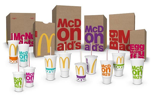
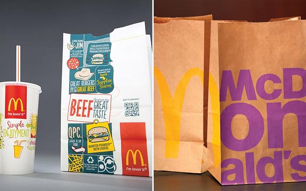
McDonald's has dropped its clown-like red, yellow and white packaging in favour of bright colours on brown paper in an effort to modernise its image.
The move is the latest in a string of attempts to revamp the McDonald's brand in the face of increasing health concerns, slumping sales and rising competition from trendier burger joints such as Honest, Byron, Five Guys and Shake Shack.
"The new look is simple, fresh and consistent with our vision to be a modern and progressive burger company," a McDonald's spokesperson said.
The makeover marks the first time in more than a decade that McDonald's food packaging has not been white, with the brown paper bags and boxes implying a more organic, environmentally-friendly product.
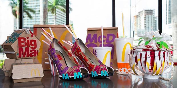
The golden arches remain but the overall design is more stylised, with the restaurant's name splashed on the packaging in bold, colourful letters of different sizes.
The new-look packaging is currently being rolled out across the US and will spread to global locations throughout 2016.
Chief executive Steve Easterbrook, who took the helm at McDonald's last year, has made it his mission to revitalise the 75-year-old company.
The Watford-born executive has run trials serving all-day breakfast and sweet potato fries as well as an almost entirely unbranded new cafe concept in Sydney.
In October, McDonald's reported a 0.9pc increase in third-quarter like-for-like sales in the US, which accounts for a third of its revenues, marking the region's first comparable sales increase in two years.
Mr Easterbrook called it "an important step in the company's global turnaround".
He said: "While still in the early stages, we believe our turnaround plan is starting to generate the change needed to reposition McDonald's as a modern, progressive burger company."
Earlier in the year, McDonald's announced it would shrink by 59 US stores in 2015 – the first time in at least 45 years that it has closed more US stores than it has opened.
Fonte:http://www.telegraph.co.uk/finance/newsbysector/retailandconsumer/12088837/McDonalds-revamps-brand-with-bold-colourful-packaging.html