Franchising, retail, business

23/07/2015
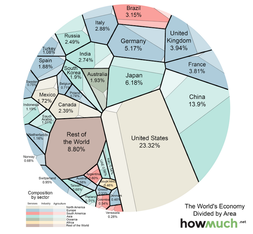
A new map by the folks at HowMuch.net provides a fascinating perspective on the worldwide economy.
The map represents each country relative to the size of its nominal gross domestic product, the type of GDP that is not adjusted for inflation. The larger the area, the larger the size of the economy.
Each area is divided into three sectors — services, industrial, and agricultural — to visualize which industries contribute most to the country’s GDP.
The result is as follows:
With a GDP upward of $17 trillion, the US comprises nearly a quarter of the world’s economy. Using data from the CIA’s World Factbook, HowMuch.net determined that most of that comes from the service sector (79.7% compared with a global average of 63.6%). Agriculture and industry make up below-average portions of the economy (1.12% and 19.1% compared with averages of 5.9% and 30.5%).
China, on the other hand, has struck more of a balance between its service and industrial sectors, with a lagging agriculture sector. HowMuch.net notes this is unusual considering other robust economies have service sectors that far outweigh industry and agriculture. HowMuch.net predicts that as China continues to grow, the service industry will expand while industry and agriculture shrink.
This article is published in collaboration with Business Insider. Publication does not imply endorsement of views by the World Economic Forum.
To keep up with the Agenda subscribe to our weekly newsletter.
Author: Matthew Speiser is an editorial intern for Business Insider covering a variety of topics.
Image: A boy touches a 45-metre (148-feet) long wall lighted by colour rays at an exhibition hall in Wuhan, central China’s Hubei province May 1, 2007. REUTERS/China Daily.
Fonte:https://agenda.weforum.org/2015/07/a-new-way-to-visualise-the-global-economy/?utm_content=buffere55b6&utm_medium=social&utm_source=twitter.com&utm_campaign=buffer